Hi everyone,
my post today is to show the last few layers of my You Are Enough journal page and the finished spread.
This is how it looked previously, after I'd added a little texture to the page using modelling paste and a mini square grid stencil.
I decided more texture was needed. So my next layer was Ranger Clear Rock Candy crackle paint which I applied with a palette knife between the strips and left the page to air dry so the crackle paint could do it's wondrous thing.
When dry, I coated each strip with Ranger Distress Glaze to protect them as best I could from the wet medium I was going to apply next. Dylusions ink sprays are water reactive and the strips were cut from a left over piece of background that I'd created using these sprays.
With the glaze in place and the crackle paint now dry, I set to and dripped a mix of Cosmic Shimmer Iridescent watercolour paints between the strips and into the crackles left by the crackle paint. There was some seepage under the strips despite the glaze but I actually liked the effect.......
There was a minuscule piece of the original background left over which was just big enough to create a tag as my focal point. The tail end of thread, from where I had bound my art journal together, gave me the idea as it stuck out from the middle of the page. Rather than snip it off I decided it could hold a tag in place. I added a coloured eyelet to the top of the tag and edged it with a little scrap of torn tissue paper and hydrangea coloured Archival ink.
I liked the look of the hydrangea ink, torn tissue paper and eyelet on the tag so did the same on the main page.....
Adding the tag to one side of the spread, as a focal point, unbalanced it, so I needed to add something to the opposite page. Using a Ranger word band I applied a little white gesso and some PaperArtsy Fresco Finish Chalk Acrylic paint (Inky Pool) to give it colour. I computer generated my sentiment onto a scrap of card and did the same to that. The baby-wipe I used to wipe off some of the excess paint and gesso looked great, so after drying it with a heat tool and distressing it a little that too was used.
The now dry baby-wipe was layered over with a little coloured tissue paper then the word band and then the sentiment. I used double sided tape to secure all the layers together and then a couple of coloured brads for decoration. The same layering was used on the tag.
To finish off I added some rings here and there plus the obligatory splatters, both using white gesso.
I was really happy with how this page came together. More so for utilising a left over piece of background that had been in my stash for awhile because I couldn't quite bring myself to consign to the bin.... glad I hadn't now. I love the texture and the colours too.
If you remember the theme for the week 42 ALAD/ASAW challenge was what would you say to your younger self. I decided I would say; "you are enough, just be yourself". Hence my chosen sentiment for the page.
I hope you liked the page and enjoyed reading the process of how it came together. Thanks so much for popping by and hope to see you again soon.
Happy crafting,
Carol. xx
Translate
Showing posts with label Journal page. Show all posts
Wednesday, 24 October 2018
Tuesday, 16 October 2018
You are enough - Journal Page continued.
Hi everyone,
a quick update on how my journal page is progressing. For today's layer I added some texture by way of modelling paste through aCreative Expressions mini stencil ( grid squares).... and that's it for today. See how easy it is to play along with France's ALAD/ASAW challenge plus it gives you time to think about your next layer the following day.
Ok, that's all for today but please pop by tomorrow when I add another layer to my journal page.
Happy crafting
Carol. xx
a quick update on how my journal page is progressing. For today's layer I added some texture by way of modelling paste through aCreative Expressions mini stencil ( grid squares).... and that's it for today. See how easy it is to play along with France's ALAD/ASAW challenge plus it gives you time to think about your next layer the following day.
Ok, that's all for today but please pop by tomorrow when I add another layer to my journal page.
Happy crafting
Carol. xx
Monday, 15 October 2018
You are enough -Journal Page
Hi everyone,
Week 42 of France's ALAD/ASAW challenge started last Saturday and I decided that this week I'd try to post as I go along making my piece for the challenge.
The theme this week is 'Talk to my younger self' which basically translates to what we would say to our younger self if we could. I decided a pep talk encouraging my younger self that she is enough just as she is and to be who she is, is what I'd like to tell her.
Layer One: To start off my page I used Peacock Feathers & Tumbled Glass Distress Paint and then softened it a little with Picket Fence.
Layer two: Stamping. I used a couple of stamps, one by Visible Image called Ink Splats and the other by Prima. The latter was a script/text background stamp but unfortunately I can't recall it's name and it isn't written anywhere on the packaging (sorry). Using Archival ink in both Hydrangea and French Ultramarine, I stamped randomly over my page, doing second generation stamping when I used the ink splats stamp.
Layer three: Dimension. Amongst my stash I have a background I made ages ago using Dylusions Sprays and water splashes. It was just the thing to provide more colour and add dimension to my page. This is the background piece before I started.....
And this is what it looked like after it was added to my page....
I quite like it! But that's it for now. Tomorrow is another day and with that comes another layer. I hope you'll stop lay and see how my journal page evolves from here.
Happy crafting.
Carol. xx
Saturday, 13 October 2018
What goes around, comes around - Journal Page
Hi everyone,
I've just finished Week 41 of France's ALAD/ASAW weekly challenge, where the theme was 'A quote to live by'. I laughed when I saw Kathleen's chosen quote, (Kathleen was the challenge host for this week), because it was the one that flew into my head. Although it's not the only quote I live by, it's certainly one of them and the one that I think is the most true in life.
Here is my finished journal page.....
......and a quick step by step run through:
I coloured my journal page and also some scraps of white card using SU watercolour crayons (subtles collection). The end result was lovely. All the different shades of blue were gorgeous and almost too beautiful to cut up.
Using three different sized circle punches, I cut a variety of circles from the now coloured scraps. I ran double sided tape along the back of each circle to hold it in place whilst I stitched them into strips of various lengths on my sewing machine.
A word of warning here! Using double sided tape with your sewing machine isn't a great idea, as the glue from the tape builds up and causes both the needle and thread to stick. I've learnt this from previous experience and now use hand sanitiser to wipe down the needle frequently to prevent any build up. It makes it very slow going but it will at least keep your machine in one piece!
I also ran a line of stitching around my journal page, or at least as much as the constraints of the journal would allow.
To add some detail to the lower part of my page, I added some embossing using an IndigoBlu stamp (bubbles) and white SU embossing powder.
The circle strips were then arranged and layered along the top of my page and glued into place...... glued, because the backing to the double sided tape wouldn't pull off after I'd put a line of stitching down the back of each strip, as I thought it would. Using more double sided tape on top of the existing tape wasn't an option either, as it wouldn't stick to the backing paper of the tape that was already there. Glossy Accents was my only option given I wanted the strips to be held permanently in place.
At this point I felt the page looked too top heavy and decided to 'knock back' the strips into the background by dry-brushing a little white gesso over them. It definitely looked better once I'd done this.
I'm having a bit of a love affair at the moment with Stampendous chunky white embossing enamel, so I mixed this with Stampendous Frantage Chalky White Deep Impressions embossing powder (shabby opaque blue) and sprinkled this randomly and rather liberally over my circle strips and down the margins of the page. This served to 'knock back' the strips even more and to add some shimmery texture to them. I was more heavy handed at the top of the page and gradually less so as I sprinkled the EP down the page.
To balance my page I stamped a Vivas las Vagastamp (scribbled circle) in French Ultramarine Archival ink across the centre of the page, at the bottom. This was a bit of a challenge but with the aid of TH's stamping platform it work well enough.... phew, it all could have gone horribly wrong at that point!
My quote was computer generated in blue ink and edged with a SU watercolour marker pen (not quite navy).
I'm pleased at how the page turned out despite the challenges. Stamping on an uneven surface let alone across the centre of an art journal and over embossing (which acts as a resist) is never a good idea. Also adding so much texture across a page can make it difficult to close a journal but careful placement of my strips countered this.
One niggle is that the 'white' embossing powder I used for the lower half of the page was not as white as the Stampendous EP and looks almost cream against it. Luckily it's very light so isn't that noticeable I hope.
Overall I'm cool with my page and hope you like it too. Thanks so much for dropping by and taking time to read my post. A new ALAD/ASAW has started today (week 42) so please pop by again to see how my challenge piece for week 42 evolves.
Have a wonderful day and happy crafting.
Carol. xx
I've just finished Week 41 of France's ALAD/ASAW weekly challenge, where the theme was 'A quote to live by'. I laughed when I saw Kathleen's chosen quote, (Kathleen was the challenge host for this week), because it was the one that flew into my head. Although it's not the only quote I live by, it's certainly one of them and the one that I think is the most true in life.
Here is my finished journal page.....
......and a quick step by step run through:
I coloured my journal page and also some scraps of white card using SU watercolour crayons (subtles collection). The end result was lovely. All the different shades of blue were gorgeous and almost too beautiful to cut up.
Using three different sized circle punches, I cut a variety of circles from the now coloured scraps. I ran double sided tape along the back of each circle to hold it in place whilst I stitched them into strips of various lengths on my sewing machine.
A word of warning here! Using double sided tape with your sewing machine isn't a great idea, as the glue from the tape builds up and causes both the needle and thread to stick. I've learnt this from previous experience and now use hand sanitiser to wipe down the needle frequently to prevent any build up. It makes it very slow going but it will at least keep your machine in one piece!
I also ran a line of stitching around my journal page, or at least as much as the constraints of the journal would allow.
To add some detail to the lower part of my page, I added some embossing using an IndigoBlu stamp (bubbles) and white SU embossing powder.
The circle strips were then arranged and layered along the top of my page and glued into place...... glued, because the backing to the double sided tape wouldn't pull off after I'd put a line of stitching down the back of each strip, as I thought it would. Using more double sided tape on top of the existing tape wasn't an option either, as it wouldn't stick to the backing paper of the tape that was already there. Glossy Accents was my only option given I wanted the strips to be held permanently in place.
At this point I felt the page looked too top heavy and decided to 'knock back' the strips into the background by dry-brushing a little white gesso over them. It definitely looked better once I'd done this.
I'm having a bit of a love affair at the moment with Stampendous chunky white embossing enamel, so I mixed this with Stampendous Frantage Chalky White Deep Impressions embossing powder (shabby opaque blue) and sprinkled this randomly and rather liberally over my circle strips and down the margins of the page. This served to 'knock back' the strips even more and to add some shimmery texture to them. I was more heavy handed at the top of the page and gradually less so as I sprinkled the EP down the page.
To balance my page I stamped a Vivas las Vagastamp (scribbled circle) in French Ultramarine Archival ink across the centre of the page, at the bottom. This was a bit of a challenge but with the aid of TH's stamping platform it work well enough.... phew, it all could have gone horribly wrong at that point!
My quote was computer generated in blue ink and edged with a SU watercolour marker pen (not quite navy).
I'm pleased at how the page turned out despite the challenges. Stamping on an uneven surface let alone across the centre of an art journal and over embossing (which acts as a resist) is never a good idea. Also adding so much texture across a page can make it difficult to close a journal but careful placement of my strips countered this.
One niggle is that the 'white' embossing powder I used for the lower half of the page was not as white as the Stampendous EP and looks almost cream against it. Luckily it's very light so isn't that noticeable I hope.
Overall I'm cool with my page and hope you like it too. Thanks so much for dropping by and taking time to read my post. A new ALAD/ASAW has started today (week 42) so please pop by again to see how my challenge piece for week 42 evolves.
Have a wonderful day and happy crafting.
Carol. xx
Friday, 12 October 2018
Pretty in Pink - Journal Page
Hello, hello, hello......
How are you today? Bit nippy out but the hint of sunshine is keeping me happy. Another ALAD/ASAW challenge piece/ journal page from me today, week 37 of France's challenge.
I'll apologise now if you're feeling a little unsettled at the jumping around and current lack chronological order for my posts on this challenge but bare with me please (smile).
The theme for week 37 was Pretty in Pink and I had great plans to incorporate a piece of inked vellum into the middle of my page, almost like a stained glass window type effect. But it didn't happen quite as planned and I ended up layering my coloured vellum onto the page...... you'll see what I mean as I go through the making process. First here is my finished page for you to have a look at......
See what I mean about the layered vellum. Originally the plan was for the vellum to be much lighter because of the light behind it. Hey ho, not meant to be (smile)
If you'd like to know the step by step creative process, here goes.
The first step was to cover my journal page with clear gesso and then to add colour using the wrinkle-free technique i.e dipping my page into Distress Paint (Picked Raspberry, Spun Sugar) and Adirondack metallic acrylic paint (pearl).
Using Picked Raspberry DP through France Papillon's crackled stencil I added a little more interest to the background, especially around the edges where the darker colour acted as a frame for the page.
The Picked Raspberry was a little too vibrant for what I wanted, so I softened it down by adding Spun Sugar and the metallic pearl here and there with my finger. This also added a very fine texture and delicate shimmer to the page.
Now for my piece of vellum. This was coloured with Distress Stain (Victorian Velvet and Seedless Preserves), then spritzed with Cosmic Shimmer Vintage Distress Mist (clover) and splattered with the metallic pearl.
As you know I can't resist stitchery on my pages, so I machine stitched the vellum to the background with wavy stitches. Stitching was also added around the outside of the page too. A couple of lines in fact and I now call this 'messy' stitching i.e where I make no attempt to stitch in a straight line or, if using two or more rows of stitching, to keep them together. I go where I please and let the machine do it's thuuuung. Although I used white thread I decided to colour the stitching holding the vellum and used SU watercolour pencils for this.
To apply more texture to the page I added a strip of DecoArt Modelling Paste through Fance Papillon's crackled stencil and few more metallic pearl splashes.
For more interest on the background I added a little random script stamping in SU Soft Suede and some drippage through the texture paste using the Seedless Preserves again.
Now for a focal image; I coloured a butterfly image, fussy cut it and then applied a coat of Ranger Matt Medium to both seal and stiffen it. It was layered on to a piece of hand-torn gauze and a few of the gauze threads which I dyed using left over Seedless Preserves ink on my craft sheet.
The top RHC of my page seemed bare and needed a little something. I layered up a little piece of gauze and vintage book page, then added a remnant rub on the top. This was stuck in place with double sided tape. The vintage book page, being aged to a soft beige colour, picked up the same tone in the butterfly and the SU Soft Suede ink I used to stamp the script on the page.
The final touch was to add some circles and lines using white and black gesso. Simple bottle tops and an old credit card did the job here. Unfortunately I managed to smudge a circle right in the centre of my page and couldn't for the life of me think how to cover this up without it looking obvious. So, as the mixed media guru himself says 'embrace imperfection'. I followed Tim's advice and left things be.
So that's my page for this week's challenge. Not quite what I intended when I sat down but it will do. Some you like and some you don't.... the jury is still out on this page. Either way, I enjoyed myself and they say it's the journey not the destination (smile).
Thanks so much for stopping by. Have a wonderful day and happy crafting.
Carol. xx
How are you today? Bit nippy out but the hint of sunshine is keeping me happy. Another ALAD/ASAW challenge piece/ journal page from me today, week 37 of France's challenge.
I'll apologise now if you're feeling a little unsettled at the jumping around and current lack chronological order for my posts on this challenge but bare with me please (smile).
The theme for week 37 was Pretty in Pink and I had great plans to incorporate a piece of inked vellum into the middle of my page, almost like a stained glass window type effect. But it didn't happen quite as planned and I ended up layering my coloured vellum onto the page...... you'll see what I mean as I go through the making process. First here is my finished page for you to have a look at......
See what I mean about the layered vellum. Originally the plan was for the vellum to be much lighter because of the light behind it. Hey ho, not meant to be (smile)
The first step was to cover my journal page with clear gesso and then to add colour using the wrinkle-free technique i.e dipping my page into Distress Paint (Picked Raspberry, Spun Sugar) and Adirondack metallic acrylic paint (pearl).
Using Picked Raspberry DP through France Papillon's crackled stencil I added a little more interest to the background, especially around the edges where the darker colour acted as a frame for the page.
The Picked Raspberry was a little too vibrant for what I wanted, so I softened it down by adding Spun Sugar and the metallic pearl here and there with my finger. This also added a very fine texture and delicate shimmer to the page.
Now for my piece of vellum. This was coloured with Distress Stain (Victorian Velvet and Seedless Preserves), then spritzed with Cosmic Shimmer Vintage Distress Mist (clover) and splattered with the metallic pearl.
As you know I can't resist stitchery on my pages, so I machine stitched the vellum to the background with wavy stitches. Stitching was also added around the outside of the page too. A couple of lines in fact and I now call this 'messy' stitching i.e where I make no attempt to stitch in a straight line or, if using two or more rows of stitching, to keep them together. I go where I please and let the machine do it's thuuuung. Although I used white thread I decided to colour the stitching holding the vellum and used SU watercolour pencils for this.
To apply more texture to the page I added a strip of DecoArt Modelling Paste through Fance Papillon's crackled stencil and few more metallic pearl splashes.
For more interest on the background I added a little random script stamping in SU Soft Suede and some drippage through the texture paste using the Seedless Preserves again.
Now for a focal image; I coloured a butterfly image, fussy cut it and then applied a coat of Ranger Matt Medium to both seal and stiffen it. It was layered on to a piece of hand-torn gauze and a few of the gauze threads which I dyed using left over Seedless Preserves ink on my craft sheet.
The top RHC of my page seemed bare and needed a little something. I layered up a little piece of gauze and vintage book page, then added a remnant rub on the top. This was stuck in place with double sided tape. The vintage book page, being aged to a soft beige colour, picked up the same tone in the butterfly and the SU Soft Suede ink I used to stamp the script on the page.
The final touch was to add some circles and lines using white and black gesso. Simple bottle tops and an old credit card did the job here. Unfortunately I managed to smudge a circle right in the centre of my page and couldn't for the life of me think how to cover this up without it looking obvious. So, as the mixed media guru himself says 'embrace imperfection'. I followed Tim's advice and left things be.
So that's my page for this week's challenge. Not quite what I intended when I sat down but it will do. Some you like and some you don't.... the jury is still out on this page. Either way, I enjoyed myself and they say it's the journey not the destination (smile).
Thanks so much for stopping by. Have a wonderful day and happy crafting.
Carol. xx
Tuesday, 9 October 2018
Silver Lining - Journal Page.
Hi,
I'm sharing my journal page for France's week 36 ALAD/ASAW Challenge. This week's theme: No one said it would be easy. I decided to take a positive slant on the theme and this is what I created....
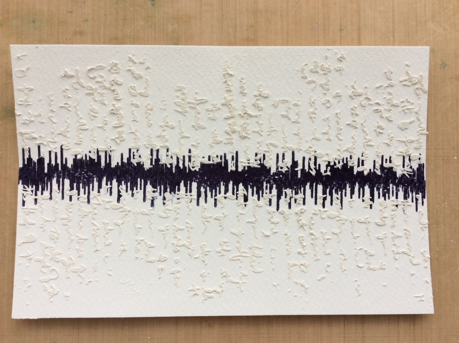
I started out with watercolour card and after priming my page with clear gesso, I stamped it with the sound wave stamp from IndigoBlu's light and sound borders set in Hydrangea Archival ink.
I loved how this image looked once stamped and actually went off on a bit of a tangent for an hour or so, stamping it different colours and directions. Basically just having a play with my new stamp.... I'm not sure if this is an old IndigoBlu set because I picked it up at the NEC hobbycraft show earlier this year for an absolute song! This is the set. I can see tons of possibilities with all of these borders and suspect I'll get plenty of mileage out of this set.
Next came some texture. Using a CraftersWorkshop stencil (mini believe script) and, working at 90 degrees to my stamped image, I added some texture paste to my page.
My next layer was colour: Firstly Tumbled Glass Distress Stain.
Followed by Broken China DS..........
and then finally Faded Jeans DS.
Then my favourite layer, messy stitching. An edge of French Navy machine stitching around the outside of my page.
Now I was ready for my focal point. To create my silver lining I used Plebeo mirror foil sheets along the centre of my stamped image.
Finally, for my sentiment I computer generated my words in blue ink onto a scrap of hand-torn white card and adhered it to the page. Then I tore a piece of vellum, ever so slightly larger than my hand-torn card, and layer this over the top. For some reason I wasn't inclined to ink up the hand-torn card but still wanted to soften the stark whiteness of the card. As I love working with vellum, this was my chosen option to create the effect I was looking for. The rough torn edges of the card and vellum compliment the irregularity of the script too.
I was sooo happy at how this page turned out. It was definitely a couple of those rare days when the image you have in your head actually manifests on the craft mat. This spread was definitely the end result that I had envisage as my piece for this weeks challenge.
Thanks for stopping by and as ever, happy crafting.
Carol. xx
I'm sharing my journal page for France's week 36 ALAD/ASAW Challenge. This week's theme: No one said it would be easy. I decided to take a positive slant on the theme and this is what I created....
I started out with watercolour card and after priming my page with clear gesso, I stamped it with the sound wave stamp from IndigoBlu's light and sound borders set in Hydrangea Archival ink.
I loved how this image looked once stamped and actually went off on a bit of a tangent for an hour or so, stamping it different colours and directions. Basically just having a play with my new stamp.... I'm not sure if this is an old IndigoBlu set because I picked it up at the NEC hobbycraft show earlier this year for an absolute song! This is the set. I can see tons of possibilities with all of these borders and suspect I'll get plenty of mileage out of this set.
Next came some texture. Using a CraftersWorkshop stencil (mini believe script) and, working at 90 degrees to my stamped image, I added some texture paste to my page.
My next layer was colour: Firstly Tumbled Glass Distress Stain.
Followed by Broken China DS..........
and then finally Faded Jeans DS.
Then my favourite layer, messy stitching. An edge of French Navy machine stitching around the outside of my page.
Now I was ready for my focal point. To create my silver lining I used Plebeo mirror foil sheets along the centre of my stamped image.
Finally, for my sentiment I computer generated my words in blue ink onto a scrap of hand-torn white card and adhered it to the page. Then I tore a piece of vellum, ever so slightly larger than my hand-torn card, and layer this over the top. For some reason I wasn't inclined to ink up the hand-torn card but still wanted to soften the stark whiteness of the card. As I love working with vellum, this was my chosen option to create the effect I was looking for. The rough torn edges of the card and vellum compliment the irregularity of the script too.
I was sooo happy at how this page turned out. It was definitely a couple of those rare days when the image you have in your head actually manifests on the craft mat. This spread was definitely the end result that I had envisage as my piece for this weeks challenge.
Thanks for stopping by and as ever, happy crafting.
Carol. xx
Thursday, 4 October 2018
Beauty in Nature - Journal Page
Hi everyone,
todays share was my art journal page for Week 35 of France's ALAD/ASAW Challenge, where the theme was Beauty in Nature. As soon as I read the theme I knew I wanted to use the shaving foam marbled paper technique I'd tried a couple of weeks earlier for my background.
If you've not seen this technique on YouTube then you are in for a treat. It is soooo simple to do and every time I've tried it, it's worked a treat, giving me not only gorgeous marbled papers and card but also papers and card that smell fabulous for literally months afterwards.
Here is my finish journal page.......
And here is the step by step run through of how I createdit.
I wanted my marbled background to be soft subtle greens. So I chose a mix of Pesto alcohol ink, Fresh Lime Dylusions spray and a Stamping Up re-inker in Old Olive.... yes, I mixed them all up in the shaving cream, alcohol ink, watercolour spray and ink and it all worked perfectly together. These are some of the backgrounds I had to choose from for this page.......
Using a Stamping Up stamp of a maiden hair fern and white SU embossing powder I stamped the image repeatedly around the outside of my page. Then used Shabby Shutters, Peeled Paint and Forest Moss Distress Inks to highlight the embossed stamping.......
Now this is where I have to own up. I loved the end result (above), especially as the darker ink blended over the white embossing made the image really 'pop' from the page, but it was going to make my spread too dark. My next layer was going to obliterate the marbled background and only leave the dark edges showing.
So choosing another piece from my marbled collection, I repeated the heat embossed stamping but only used a very light touch blending the DI around the edges this time, leaving out Forest Moss DI altogether and gently distressing the edges instead.
todays share was my art journal page for Week 35 of France's ALAD/ASAW Challenge, where the theme was Beauty in Nature. As soon as I read the theme I knew I wanted to use the shaving foam marbled paper technique I'd tried a couple of weeks earlier for my background.
If you've not seen this technique on YouTube then you are in for a treat. It is soooo simple to do and every time I've tried it, it's worked a treat, giving me not only gorgeous marbled papers and card but also papers and card that smell fabulous for literally months afterwards.
Here is my finish journal page.......
And here is the step by step run through of how I createdit.
I wanted my marbled background to be soft subtle greens. So I chose a mix of Pesto alcohol ink, Fresh Lime Dylusions spray and a Stamping Up re-inker in Old Olive.... yes, I mixed them all up in the shaving cream, alcohol ink, watercolour spray and ink and it all worked perfectly together. These are some of the backgrounds I had to choose from for this page.......
Now this is where I have to own up. I loved the end result (above), especially as the darker ink blended over the white embossing made the image really 'pop' from the page, but it was going to make my spread too dark. My next layer was going to obliterate the marbled background and only leave the dark edges showing.
So choosing another piece from my marbled collection, I repeated the heat embossed stamping but only used a very light touch blending the DI around the edges this time, leaving out Forest Moss DI altogether and gently distressing the edges instead.
Monday, 1 October 2018
Elements of a Day - Journal Page
Hi everyone,
still playing catch up (again!) with my posts. Today is another journal page and a France challenge piece (Week 34. Theme - Perfect Day).
I decided to follow the theme by including on my journal page all or at least some of the things that would help make up my perfect day. To start with books... for me no day would be complete without a little reading or at least looking at vintage books or novels. So to get texture on my page I wove some vintage book pages together.......
I love fauna and flora. For me spending a day out in the garden or countryside is bliss, especially if the sun is shinning. So to symbolise this I added some random piece of Ranger botanical washi tape (and a little masking tape for good measure).
No day would be complete for me without a little crafting so this was symbolised by the wash of black & quit. gold acrylic paint and then a scrapping of white gesso. Plus a few more pieces of torn vintage book page (you can't have too many books, now can you)
Apart from crafting I love all things embroidery. Whether it's machine stitching, embroidery, silks, threads, fabrics or beads, I love it all. So there had to be a wee element of this on my spread.
First it was a little machine stitchery around the edges.........
then to secure a lovely piece of lace from my stash.
For my focal element I added a Ranger Alphabet Transparency Tile, warping slightly with a heat gun. My letter of choice was M, the initial of my special someone. Next was a Ranger Mini Plaquette on, coloured with a Titan Buff and a number 13 Remnant Rub. Whilst unlucky for some this is the date on which I met, got engaged and then married my special someone, so it's a special number for me.
Finally no day would be perfect for me if it didn't include snuggling down with a glass of wine, my special someone close and a good film, hence the Ranger filmstrip holding my sentiment in place. (Hmm, should have included some red splatters to symbolise the wine perhaps...lol)
This really was a fun page to pull together and whilst I could have gone on and on trying to symbolise what else could be included in my Perfect Day, I actually was happy stopping here. It covered my best elements I think.
Thank you as always for stopping by and letting me share a bit of craftiness with you today.
Happy crafting,
Carol. xx
still playing catch up (again!) with my posts. Today is another journal page and a France challenge piece (Week 34. Theme - Perfect Day).
I decided to follow the theme by including on my journal page all or at least some of the things that would help make up my perfect day. To start with books... for me no day would be complete without a little reading or at least looking at vintage books or novels. So to get texture on my page I wove some vintage book pages together.......
I love fauna and flora. For me spending a day out in the garden or countryside is bliss, especially if the sun is shinning. So to symbolise this I added some random piece of Ranger botanical washi tape (and a little masking tape for good measure).
No day would be complete for me without a little crafting so this was symbolised by the wash of black & quit. gold acrylic paint and then a scrapping of white gesso. Plus a few more pieces of torn vintage book page (you can't have too many books, now can you)
Apart from crafting I love all things embroidery. Whether it's machine stitching, embroidery, silks, threads, fabrics or beads, I love it all. So there had to be a wee element of this on my spread.
First it was a little machine stitchery around the edges.........
then to secure a lovely piece of lace from my stash.
For my focal element I added a Ranger Alphabet Transparency Tile, warping slightly with a heat gun. My letter of choice was M, the initial of my special someone. Next was a Ranger Mini Plaquette on, coloured with a Titan Buff and a number 13 Remnant Rub. Whilst unlucky for some this is the date on which I met, got engaged and then married my special someone, so it's a special number for me.
Finally no day would be perfect for me if it didn't include snuggling down with a glass of wine, my special someone close and a good film, hence the Ranger filmstrip holding my sentiment in place. (Hmm, should have included some red splatters to symbolise the wine perhaps...lol)
This really was a fun page to pull together and whilst I could have gone on and on trying to symbolise what else could be included in my Perfect Day, I actually was happy stopping here. It covered my best elements I think.
Thank you as always for stopping by and letting me share a bit of craftiness with you today.
Happy crafting,
Carol. xx
Subscribe to:
Posts (Atom)