Translate

Showing posts with label Journals/albums. Show all posts

Thursday, 2 July 2015

The Gentleman Crafter & the Archivist Journal

I'll warn you now that this is a photo heavy post, so grab a seat and your favourite cuppa and enjoy.......  actually it isn't as photo heavy as I planned because for some reason I couldn't get some of my photos to re-orient themselves...dooooough!!!

 I was lucky enough to share one of Jim's workshops to make this STUNNING Archivist Journal at AFTH in Harrogate recently. Isn't it amazing!
Yes, that's a little tin on the front.


My album turned out a little more chunky than
the original as I added a few extra inclusions.
Jim was truly wonderful. His name is so apt too. He is every bit a gentle gentleman and both he and Caesar were infinitely polite and patient.   The workshop was great fun, filled with little treats and give aways. All the supplies and embellishments 
were excellent quality, the written instructions were explicitly detailed and there were oodles  of goodies left over.... definitely value for money.  The whole day was fantastic....  I  can't enthuse about it enough. 

My only regret was that I hadn't booked on to the other three  workshops that Jim was doing that weekend.

Here are a few pics of my finished album...


This is the opened journal; pages on the left secured in place with a ribbon and a pocket in the back inside cover


The first page opened out.... couple of plain black tags in pockets.... touch of white Stigno pen writing in the margin.


This is the back of the first page opened out.  One huge pocket and tag on the main back.  Over the main pocket there is another couple of flaps, the first of which I embellished with a SU die cut layered with a Ranger tag label and ring fastener.

The LHS flap has a vertical pocket in which I tucked a plain black journalling tag and a little flip open booklet. Peaking out from behind is a Ranger word band.

Second page with a pocket.  The flap was secured with a black circular tag and brad.

The back of this page has a simple horizontal pocket at the bottom with a black journalling tag.

Jim did a very ingenious, nifty ring binding system using garment pins and brads. I decided to cover the plain brads with Ranger number brads. I cut off the metal spikes at the back and secured them in place with a little Glossy Accents. 


 This is the inside of another page in the journal. The tag at the top sits inside the vertical pocket on the LHS flap.  The centre has just a plain black envelope which I lined with the same paper as the back of the page. The envelope is secured with a circular tag, covered in the same paper and a ranger number brad.
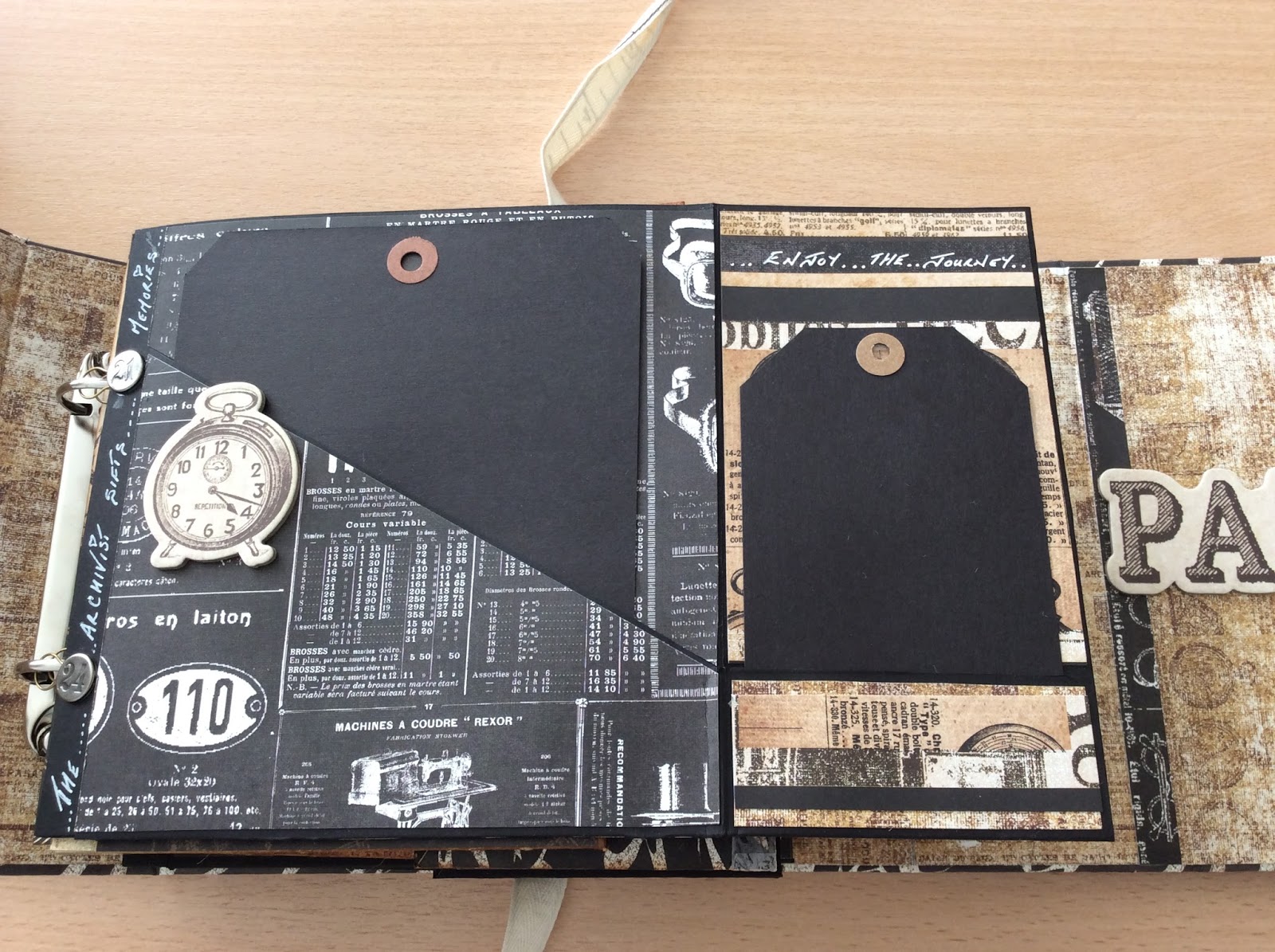
 This is the front of the piste de resistance page in the journal.. there are two horizontal flaps. The lower  flap has a Ranger file tab on the edge and a small diagonal pocket with a gorgeous chipboard clock popped on the front. A  couple of black journalling tags are tucked inside. 

Jim alternated his tags between Ranger manilla and black tags, the pages in the journal too but I decided I liked the look of black tags that I used them throughout.


 Et Voila!   This is what is tucked away inside when you open those two horizontal flaps..... four gorgeous little tins.  I've popped some of the left over chipboard pieces inside. The black oval circles are there for me to add details of what's inside the tins.  I also added a couple of pockets layered with more chipboard goodies on the inside of each flap.

These are what goes inside those pockets.... a wee salary envelope with a magnatised Ranger metal word tag and a wee plain black journalling tag. I'll probably be doodling on my pockets a tittle when I come to journal on my tag


 This is the reverse of the page....just a large pocket.  It has a gusset so can take one or two tags or a booklet.
 I decided to make a simple booklet out of this absolutely gorgeous 7 Gypsies Archivist paper
 This is the very back cover of the journal.  You can just see the ribbon peeking out from behind the envelope.  Adding the ribbon is a nice touch as it holds the pages securely in place inside the journal and will take pressure off the binding when the inclusions are full.  Looking at it now, it looks a little clean and needs a touch of Vintage Photo Distress Ink.

I added just a plain black envelope which I layered with another chipboard piece on the flap and more of the paper on the inside and outside lower section.


 This is the other section of the inside back of the journal.  I added a black vertical pocket (Why?  Just because I could...lol)  which I layered up with  more of the paper and the  huge chipboard Paris piece.
 Then having made the pocket I needed something to fill it..... oh, and use up more of my pad of paper (have I mentioned how much I ADORE this paper!) 

As you can see just a very simple booklet with comic binding and lots of pocket and flaps to write on. I really love the look of white ink on black paper and this paper is just beautiful without any emblishment.

Here's just a very quick flip through the pages.......


So there you have it..... The only thing left for me to say is thank you Jim for such a fun day.  If you haven't found Jim's website yet, you're in for a real treat. 

Happy crafting and thank you for stopping by, 

Carol. x 


Sunday, 7 June 2015

Tammy Tutterow Journals

These are my take for a couple of journal covers using a tutorial very kindly shared by Tammy.


The first one used some map fabric samples I had from John Lewis (this is seriously wonderful canvas!!!!) and I have to say this journal cover  is my favourite of the two.  (Might have to invest in a metre or two of this fabric as I feel other projects coming on....YEA!)


The fabric, although being canvas, is a lightweight furnishing fabric so was slightly thicker and sturdier to work with. I followed Tammy's tut. and pinked the edges of the material with pinking shears which made the fit around the internal mat boards much tighter.

I stitched in black along the latitude and longitude lines to give a slightly quilted effect. For the front embellishment I used a small piece of faux suede which I frayed at the edges, a free-hand cut heart of adhesive canvas which I inked and stamped.


The GORGEOUS frame was one that I've had in my stash and been hoarding for ages, just because I couldn't bare to part with it. I've no idea where it came from originally SOOOOOO it had to be for just the right project.  As this little journal cover is for my special person because of her love of travel this had to be the project.


The other embellishments are Ranger Idea-ology ..... sure you knew that anyway.   Oh and a couple of SU jumbo eyelets for the binding on the spine.

Here are a couple of other pics.......

Inside the journal cover

Back view


This is the second journal cover... a departure from Tammy's tut as I decided that I didn't want to pink my edges this time. Instead I made a sleeve, so that the edges of the material were on the inside and hand stitched the last seam (on a short edge)  to close the matt boards inside.  Much more fiddly and it didn't give such a tight fit of the material over the matt boards doing it this way.


Again I quilted the cover, stitching along the architectural lines on the Ranger Eclectic Elements fabric.


For my embellishments I cut out a few pieces from the other Eclectic Elements fabric designs and padded those before inking and stitching them on. I also added a couple of Idea-ology pieces, measure tape and mini metal corners.

Again there are my trusty SU Jumbo eyelets in the spine of the cover.


This is the inside of the Journal cover and as I'm looking at it I think I might add a small pocket on the front inside cover.... either with some fabric glue or hand stitched or both!


I'm off now to make up my signatures.... for the travel journal I'll add a couple of distressed atlas and road map pages and pockets for interest. Ranger's Correspondence paper pad will be perfect for this journal too.

Hope you liked me sharing these with you as much as I've enjoyed making them over the last week or so.... thanks so much to the very talented Tammy for generously sharing the original tut.

Happy crafting all,


Carol. x

Tuesday, 12 June 2012

Loo Roll/TR Vertical Mini Album

Hi there,

I mentioned in my previous post that I'd made three journals/albums recently, this is the second one.... a Loo Roll Mini Album ( I think some people prefer to call them TR Vertical Mini Album).

There are actually two silver leaves hanging from
 the silver daisy charm but one  is hidden from view.


I came across these little albums whilst surfing the net and was so fascinated that I decided to have a go making one for myself. BUT true to form I couldn't wait until I saved up six loo rolls, so I improvised and made the loo roll casings using SU cardstock. It was easy enough to do and at least this way it made sure all the casings were the same size unlike different makes of loo rolls. 

You can see the Rich Razzleberry cardstock
I used as my base for the pockets and the tags.
I then matted various designs of  SU paper on top.


I also decided that I wouldn't cover the loo roll casings but leave the colour of the lovely cardstock showing and use it to off-set my matted layers on top. Most loo roll mini journals use 6 loo rolls for the inside pockets but I decided I wanted mine a little fuller.  Using the cardstock casings instead of  loo rolls, which are thicker cardboard, meant I was able to double my pockets to 12.


Here you can see all 12 pockets and  inserts 


I used various papers from SU to mat onto the casings and connected them to the spine with the 'Stack the Deck' hinge system. It took a little fiddling with the measurements but it worked out perfectly for the space I'd given my self for the spine.


The inner tags were all cut from the same coloured cardstock as the casings but matterd up with a little delicate pink paper from my stash. At the top of each tag I cut a scalloped circle in paper that matched the paper layered on the outside casing of each pocket. 


 I folded each scalloped circle in half over the top of the tag, then I used the  SU tab punch to create  a tab from the coloured cardstock and stuck one of these over each  of the scalloped circles to make the pull for each tag.


The cover was also covered with SU paper (same paper inside and out) with a tiny magnet for the closure. A little cream Guipure lace formed my decoration on the outside with a couple of lace leaves, fussy cut, to hide the magnet (I only decided to use magnets to close the mini as I was half way through fixing the paper to the outside of the cover, so it was a little too late to hide it under the paper....groan!... so I had to resort to Plan B and use some of my lace.).  When the cover is closed these lace leaves are hidden.


I also used a little SU 3/8" cream & Rich Razzleberry taffeta ribbon on the outside too. Originally I was going to use jumbo eyelets on the top of the cover to thread my ribbon through before tying the bow but decided in the end that they might look a little too heavy and tied the ribbon around the top of the cover instead.

The daisy clasp was from my stash, to which I added a couple of silver leaf charms to hopefully tie in with the lace leaves.

Hope you like this mini album.  It was soooo easy to rattle off that another might be in the making soon.  I'd love to hear if you have any comments, so please feel free to leave me any.

Hugs

Carol. xx

Journals.

I'm ashamed at how long it has been since my last post but I do have a lovely excuse. I've been happily making a few journals.

I've always loved books, whether it's books to read or just note books, and the fascination with book binding has always been there for me. In my blog-surfing I came across Marion Smith's website (http://www.marionsmithdesigns.com) and couldn't resist downloading one of her digital kits to make. All her digital journal kits are lovely but it was the Journey Hybrid mini that took my eye.  It took me a while to make, snatching a few hours here and there, but it was such fun that when I finished I couldn't stop there and had to have a go at making a toilet roll mini and then a notebook using classic book binding techniques.

So here they are:-

This is the notebook using classic book
binding techniques
The little loo roll mini album

Journey Hybrid Mini.
If you've read my previous posts you'll know that grunge doesn't come easily to me, so this journal was somewhat of a challenge again.

Jumbo eyelets on the spin
and Crystal Effects Tag

For the cover I printed onto cream calico which  I then inked with Tim Holtz Distressed Inks, punching a couple of jumbo eyelets for the Mother of pearl button closure and the binding ties in the spine. The calico was backed with double sided sticky plastic and the inside covered with paper from my stash.

Mother of Pearl button closure
Quite a full little album!
For the signatures I used a mix of the kit digi download pages and Paper Cellar Ltd 6 x 6  papers.  Here's a run through of the pages but be warned as it's a long post!


Inside the front cover I made a small wage slip envelope which secured with a SU antique brad.  The clock was embossed and all the pages distresses with ink to  give them an aged look.


 Page two has a small pocket on the left hand-side and a journaling area on the right.  


For this page I made a double sided tag pocket and embellished it with Tim Holtz cogs and an old clock face I photocopied & then covered with Glossy Accents.

This picture shows the tabs pulled out of the pocket on each side.
I loved the way this page turned out.  I embossed parts of the hat and used Glossy Accents on the lenses of the  goggles.  The lace I dyed with Distressed Ink.  I stamped the right hand-side page with a background script stamp and computer generated the ink bottle and quill.  Finally a chip board tag using a Tim Holtz technique.


Here I made a hidden pocket using the same paper for the top of the tag.  A smaller inner leaf was secured to the bottom of the page.  Plenty of room for journalling on this page.
Quite a simple page... I wanted to try out a Tim Holtz stamp set:Urban Chic (CMSO86) so I stamped on plain paper then inked the edges to blend it in with the rest of the pages in the album. 

And this is what is tucked away inside the
pocket on that page.  A little chipboard tag....


A small flap with a tiny embossed rose tag on the left hand-side.
 The hot air balloon also got the same embossing treatment on the
 opposite page. With Tim Holtz tissue tape adorning  the small pocket. 


Another blank page that I ran riot on... I used SU The Open Sea stamp set to create these pages, embossing some of the ledger print and the other elements: the ship, anchor and the world.

I tried out the effect first on a tag and decided to use that on the page too. Over stamping with text from the Urban Chic stamp set.

A little journalling spot hidden under the tag.


These pages are very similar to a couple I used earlier  in the album.  I loved creating them so much the first time round that I wanted to have another go.  This time I computer generated the scent bottle, then  I embossed over the silver filigree  design on the bottle.

On the left hand page I made a small envelope and tucked a small chipboard tag from my stash inside.


Again a blank page I stamped up using a SU background stamp.  I saw a one page book being
    made on YouTube and couldn't resist having a go.... But this one was M's journal input. Stamped up with En Francais script.


A little band hidden behind.

I liked this digi kit page as it was when I downloaded it. 
So other than embossing the cyclist I otherwise left it alone.  
The right hand page doesn't show too well in the 
picture but it replicates a ledger page.


I decided to actually use the clock-face that I  photocopied for an earlier page... thought it looked quite fun layered onto yet more En Francaise script. The left hand page has a small pocket which I made from a tag. I used an identical tag for the insert so when the tag is in place it gives the illusion of all one piece of paper.


 I decoupaged the top of the dress form and embossed it to give it a little more texture. The roses  across the corner of the page were also decoupaged.  The opposite page has a pocket placed (intentionally) slightly off line.  A row of bingo numbers were glued to the bottom and embossed... why?  I have no idea! I just went with the flow.
This is the little tag inside the 'wonky' pocket.


Another wage slip envelope but this time one I made from computer generated paper I had left over from an earlier project (Think you'll recognise it from an earlier blog posting).

The Steampunk lady I printed first onto patterned  paper then again on cardstock, which I then fussy cut and layered slightly off centre on the printed image.  A wee bit of embossing here and there on her dress, hat and of course the crow ( well couldn't miss him out!)

There are a couple of small pockets tucked away at the side of this page... you can just see the finger grip circle behind the Steampunk lady in the above picture.


Here are the journalling tags half pulled out of the pockets.


With these pages I fussy cut the edge design on the designer  paper and used them to make  two vertical pockets on each page.You can see a heart shaped tag that I've inserted inside the one on the right hand page.


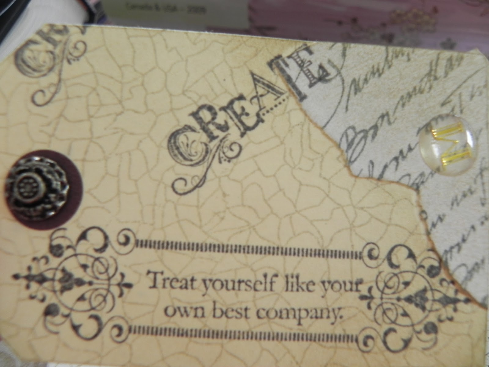
Here I've reverted to the one page book again but this time it's my effort.  I inserted a couple or three tags I made using some Tim Holtz techniques.  The stamping on the one page book is with the TH Urban Chic stamp set I mentioned earlier.

SU Creative Elements stamps, a crackle background stamp and  script stamp were used on this one with
an antique brad

For this one I used the crackle background
stamp again, then a mix of the TH Urban Chic
stamp set again.
And tucked behind the one page book, a
small flap for a photo mat or journalling tag.


A simple page of designer paper with a small flap for journalling or photo on the right hand page.


Here's that wage packet pocket appearing again. Secured with a SU antique brad (love these).  On the right hand page I layered up three of the postale postcards but left the bottom one open along the top to act as a pocket for this tag.

The eggs were such a gorgeous mottled colour that I embossed them with clear embossing powder and then a crackled glaze. ...loved the finish.


Another dress form page that had the same treatment as I described above for the earlier page. You can just make out the pocket layered on the designer paper on the right hand-side.... it took me ages to line up the birds & branches on the pocket base to match the flap!  Not sure about the brad closure on the flap though...seems a little too heavy next to the design on the paper.  Hmmm, have to revisit that.


                                                           This is a picture of the tag inside                            
                                                            the pocket


Another page where I loved the designer paper so much I just left it alone to 'show off'.  I fussy cut round the edges of the design and basically layered it over the design on the paper again to form two edge pockets... nothing in them this time.

The tag is a chip board tag that I made, again using TH techniques.  The bingo card was part of the digi kit download. I cut out a few random numbers in manilla which I dimensionalised and used Glossy Accents on to add a little interest.


A mix of pages from the digi kit download and the Paper Cellar Ltd paper pad.  There is a vertical pocket down the left hand-side page (very hard to see on this pic, sorry). Apart from embossing and using the crackled glaze  on the eggs and the bird on the circular tag, I basically left the paper to speak for itself on these pages as I loved it so much.


Goodness what can I say about these pages other than I went a bit mad on the TH butterfly tissue tape. I definitely have mixed feeling about these pages and the tag.  Sometimes I like the look and at other times I hate it.  Basically it's a random application of the tape which I then distressed with ink and then stuck an equally random application of gel letters over.  They spell out butterfly across the tag.

With the benefit of hindsight, if I could remove these  pages from the journal without ruining it I think I would.


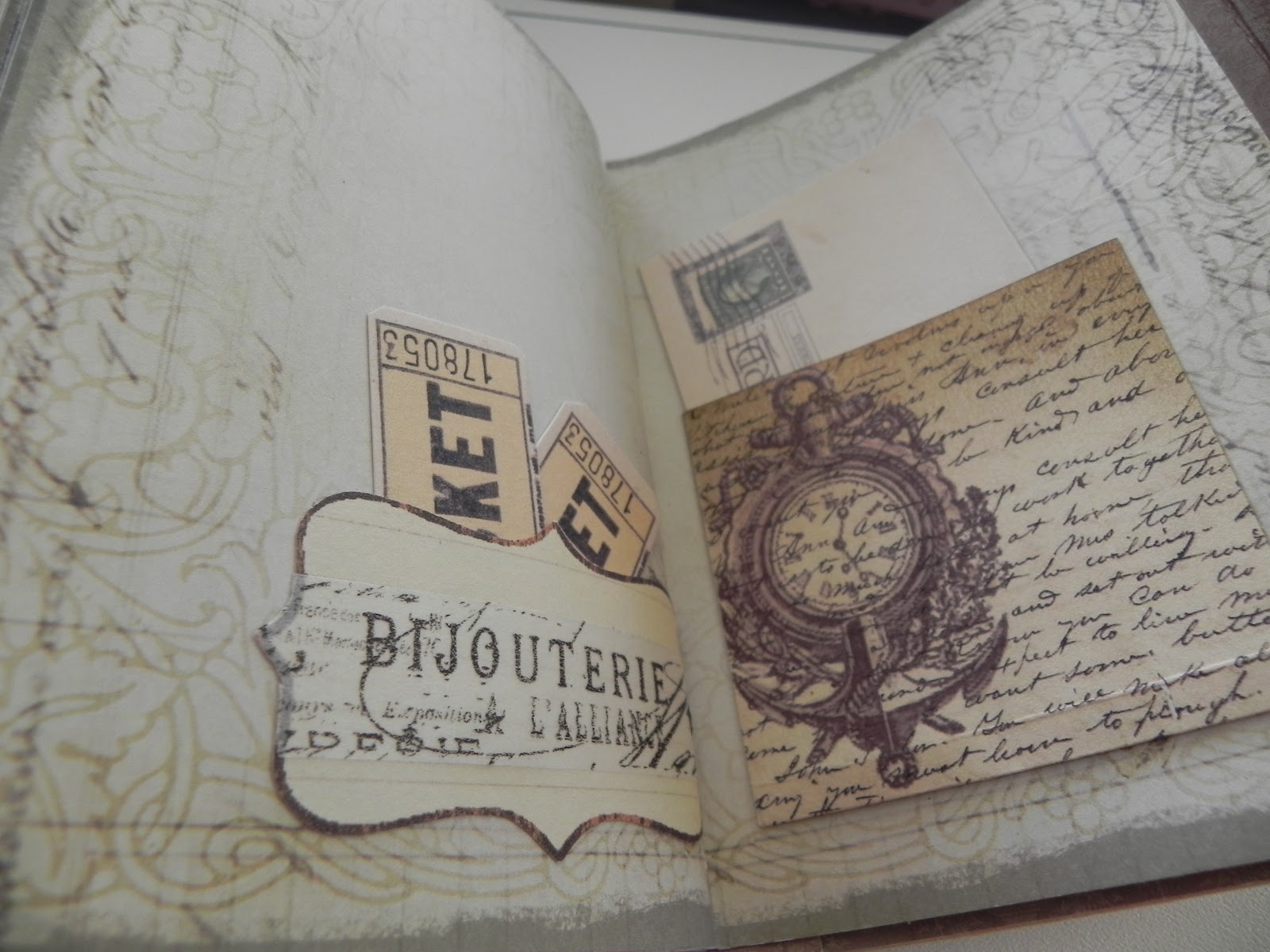
I reverted to type for these pages... pretty.  A pocket on the left hand page with a printed tag from the digi kit peeking out and a postcard journalling spot on the right hand-side.


Little pocket on the left hand page with a card insert.  Another pocket on the right hand-side  but this time with a flap and accordion sides.  Again I matched up the design on the paper with the flap and secured it with one of TH's spinners and a brad.


Postcard tag  inside the accordion pocket.
Front of the card inside the
pocket on the left hand-side.


The deckled-edged card is a buff marbled-
  effect colour ( if that makes sense) so the
 inside of the card is simple;   a decorative
 flourish and text from TH's Urban chic.


                                    A couple of simple pockets.  The left hand one is a shape cut from the digi kit but with TH's tissue tape and inked around the edge.  The right hand one is some of the digi kit paper but again with the clock embossed and inked around the edges.

Finally, finally the back page.....
 Digi kit paper on the left hand-side. Not a pocket in sight on this page but a wee bit of embossing to highlight the images. The SU Versamark pen is excellent for delicate embossing. I use it all the time.

I made a little envelope out of brown paper for the inside cover pocket and made a belly band for an extra pocket on the front. A couple of journalling tags as inserts.


This is the lining I made for the envelope. I bought a replica ration book from the Lowry War Museum recently and used one of the pages for the lining.

And this is the envelope without the insert tags and closed.  You should just be able to make out the Versamark stamping I did on the outside to tie in with the lining paper I used for the  inside of the journal cover.

Now you can see why the journal was bulging! I didn't do much in the way of bulky embellishments but did go over board with inserts/pockets.  It was my first attempt so I'll know better for next time but actually as the journal has been looked at and used it has flattened out and isn't quite so bulky now... something else to bare in mind next time.

I really hope you have enjoyed seeing my labours and would love to hear any comments you'd like to leave. It certainly was great fun making this journal..... have a go!

Hugs


Carol. xx