I've always loved books, whether it's books to read or just note books, and the fascination with book binding has always been there for me. In my blog-surfing I came across Marion Smith's website (http://www.marionsmithdesigns.com) and couldn't resist downloading one of her digital kits to make. All her digital journal kits are lovely but it was the Journey Hybrid mini that took my eye. It took me a while to make, snatching a few hours here and there, but it was such fun that when I finished I couldn't stop there and had to have a go at making a toilet roll mini and then a notebook using classic book binding techniques.
So here they are:-
 |
| This is the notebook using classic book binding techniques |
  |
| The little loo roll mini album |
If you've read my previous posts you'll know that grunge doesn't come easily to me, so this journal was somewhat of a challenge again.
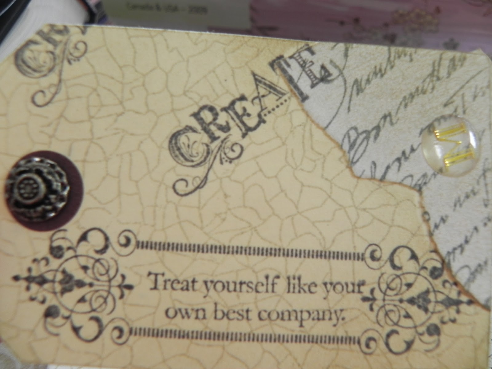
 |
| Jumbo eyelets on the spin and Crystal Effects Tag |
For the cover I printed onto cream calico which I then inked with Tim Holtz Distressed Inks, punching a couple of jumbo eyelets for the Mother of pearl button closure and the binding ties in the spine. The calico was backed with double sided sticky plastic and the inside covered with paper from my stash.
 |
| Mother of Pearl button closure Quite a full little album! |
 |
 |
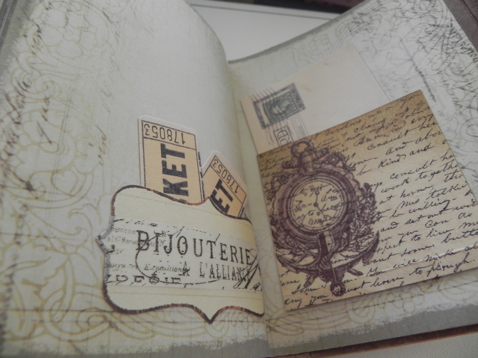
| Page two has a small pocket on the left hand-side and a journaling area on the right. |

 |
This picture shows the tabs pulled out of the pocket on each side.
|
 |
I loved the way this page turned out. I embossed parts of the hat and used Glossy Accents on the lenses of the goggles. The lace I dyed with Distressed Ink. I stamped the right hand-side page with a background script stamp and computer generated the ink bottle and quill. Finally a chip board tag using a Tim Holtz technique.
Here I made a hidden pocket using the same paper for the top of the tag. A smaller inner leaf was secured to the bottom of the page. Plenty of room for journalling on this page.
|
 |
| Quite a simple page... I wanted to try out a Tim Holtz stamp set:Urban Chic (CMSO86) so I stamped on plain paper then inked the edges to blend it in with the rest of the pages in the album. |

pocket on that page. A little chipboard tag....
 |
| A small flap with a tiny embossed rose tag on the left hand-side. The hot air balloon also got the same embossing treatment on the opposite page. With Tim Holtz tissue tape adorning the small pocket. |

Another blank page that I ran riot on... I used SU The Open Sea stamp set to create these pages, embossing some of the ledger print and the other elements: the ship, anchor and the world.
I tried out the effect first on a tag and decided to use that on the page too. Over stamping with text from the Urban Chic stamp set.
 |
| A little journalling spot hidden under the tag. |

These pages are very similar to a couple I used earlier in the album. I loved creating them so much the first time round that I wanted to have another go. This time I computer generated the scent bottle, then I embossed over the silver filigree design on the bottle.
On the left hand page I made a small envelope and tucked a small chipboard tag from my stash inside.
 |
 |
| Again a blank page I stamped up using a SU background stamp. I saw a one page book being made on YouTube and couldn't resist having a go.... But this one was M's journal input. Stamped up with En Francais script. 
A little band hidden behind.
|
 I liked this digi kit page as it was when I downloaded it.
 So other than embossing the cyclist I otherwise left it alone.
The right hand page doesn't show too well in the
picture but it replicates a ledger page.
I decided to actually use the clock-face that I photocopied for an earlier page... thought it looked quite fun layered onto yet more En Francaise script. The left hand page has a small pocket which I made from a tag. I used an identical tag for the insert so when the tag is in place it gives the illusion of all one piece of paper.

I decoupaged the top of the dress form and embossed it to give it a little more texture. The roses across the corner of the page were also decoupaged. The opposite page has a pocket placed (intentionally) slightly off line. A row of bingo numbers were glued to the bottom and embossed... why? I have no idea! I just went with the flow.
 |
| This is the little tag inside the 'wonky' pocket. |

The Steampunk lady I printed first onto patterned paper then again on cardstock, which I then fussy cut and layered slightly off centre on the printed image. A wee bit of embossing here and there on her dress, hat and of course the crow ( well couldn't miss him out!)
There are a couple of small pockets tucked away at the side of this page... you can just see the finger grip circle behind the Steampunk lady in the above picture.

Here are the journalling tags half pulled out of the pockets.
 |
| With these pages I fussy cut the edge design on the designer paper and used them to make two vertical pockets on each page.You can see a heart shaped tag that I've inserted inside the one on the right hand page. |

Here I've reverted to the one page book again but this time it's my effort. I inserted a couple or three tags I made using some Tim Holtz techniques. The stamping on the one page book is with the TH Urban Chic stamp set I mentioned earlier.
 |
| SU Creative Elements stamps, a crackle background stamp and script stamp were used on this one with an antique brad |

For this one I used the crackle background
stamp again, then a mix of the TH Urban Chic
stamp set again.
 |
| And tucked behind the one page book, a small flap for a photo mat or journalling tag. |

A simple page of designer paper with a small flap for journalling or photo on the right hand page.

Here's that wage packet pocket appearing again. Secured with a SU antique brad (love these). On the right hand page I layered up three of the postale postcards but left the bottom one open along the top to act as a pocket for this tag.
The eggs were such a gorgeous mottled colour that I embossed them with clear embossing powder and then a crackled glaze. ...loved the finish.


This is a picture of the tag inside
the pocket

Another page where I loved the designer paper so much I just left it alone to 'show off'. I fussy cut round the edges of the design and basically layered it over the design on the paper again to form two edge pockets... nothing in them this time.
The tag is a chip board tag that I made, again using TH techniques. The bingo card was part of the digi kit download. I cut out a few random numbers in manilla which I dimensionalised and used Glossy Accents on to add a little interest.

A mix of pages from the digi kit download and the Paper Cellar Ltd paper pad. There is a vertical pocket down the left hand-side page (very hard to see on this pic, sorry). Apart from embossing and using the crackled glaze on the eggs and the bird on the circular tag, I basically left the paper to speak for itself on these pages as I loved it so much.

Goodness what can I say about these pages other than I went a bit mad on the TH butterfly tissue tape. I definitely have mixed feeling about these pages and the tag. Sometimes I like the look and at other times I hate it. Basically it's a random application of the tape which I then distressed with ink and then stuck an equally random application of gel letters over. They spell out butterfly across the tag.
With the benefit of hindsight, if I could remove these pages from the journal without ruining it I think I would.

I reverted to type for these pages... pretty. A pocket on the left hand page with a printed tag from the digi kit peeking out and a postcard journalling spot on the right hand-side.

Little pocket on the left hand page with a card insert. Another pocket on the right hand-side but this time with a flap and accordion sides. Again I matched up the design on the paper with the flap and secured it with one of TH's spinners and a brad.
 |
| Postcard tag inside the accordion pocket. |
 |
| Front of the card inside the pocket on the left hand-side. |
 |
| The deckled-edged card is a buff marbled- effect colour ( if that makes sense) so the inside of the card is simple; a decorative flourish and text from TH's Urban chic. |

Digi kit paper on the left hand-side. Not a pocket in sight on this page but a wee bit of embossing to highlight the images. The SU Versamark pen is excellent for delicate embossing. I use it all the time.
I made a little envelope out of brown paper for the inside cover pocket and made a belly band for an extra pocket on the front. A couple of journalling tags as inserts.

This is the lining I made for the envelope. I bought a replica ration book from the Lowry War Museum recently and used one of the pages for the lining.

Now you can see why the journal was bulging! I didn't do much in the way of bulky embellishments but did go over board with inserts/pockets. It was my first attempt so I'll know better for next time but actually as the journal has been looked at and used it has flattened out and isn't quite so bulky now... something else to bare in mind next time.
I really hope you have enjoyed seeing my labours and would love to hear any comments you'd like to leave. It certainly was great fun making this journal..... have a go!
Hugs
Carol. xx
No comments:
Post a Comment