Yesterday I made an RSVP card for a couple of lovely friends of mine. They have a HUGE love of travel and got engaged in Rekiavik last year and will be returning there again this December for their Civil Partnership. I was lucky enough to make their CP stationary for them a couple of months ago.

So why have I called the RSVP card ‘Can’t believe it’? Well, anyone who knows me will know that I love clean lines and my cards tend to be on the feminine side. What can I say, I adore ribbons and pearls! BUT on the other hand I am utter intrigued by Tim Holtz’s techniques and the whole grunge scene. I really struggle doing it though, so I can’t believe that I decided to make a ’grungy’ card as my RSVP yesterday. My friends will love it though because it’s got a travel theme and because it’s not girly….

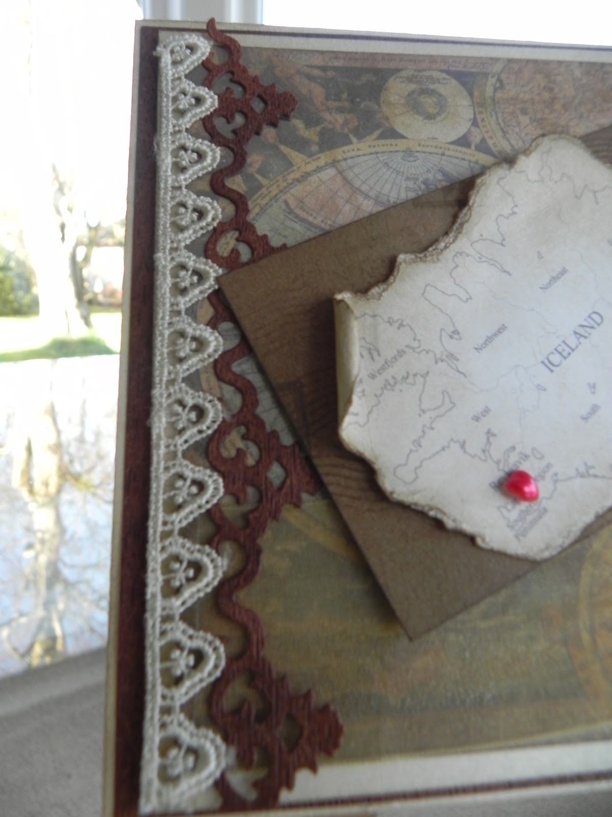
My base card was pearlescent cream (surprise surprise) layered up with some brown textured cardstock that I bought to use as tree bark on a card at some stage in the future but out it came yesterday instead. I inked up the edges of both to try to give an antique/aged effect to the card.
Next layer was the pearlescent cream, again with inked edges. I layered on top an old hemispherical world map that I printed off the net. I used a mix of SU and TH’s Distress ink around the edges, with a little more splodged around the map which I then embossed to give some texture.
 |
Using more pearlescent cardstock I used the smallest of the Spellbinders Fleur De Lis Squares to create a small stamp to the top right-hand corner of the card, again inking the edges.
I edged the card down the left-hand side with lace and a border from the Spellbinders Antique Frames & Accents. The flourish over the top of the stamp is from this set too. Both the border and the flourish were inked over with SU ink to age.
Using the medallion die from the Spellbinders Parisian Accents I made a base for my organza ribbon rosette. This too was inked with a mix of SU and TH’s Distressed ink and embossed. I had a couple of acrylic tags that I tied behind a SU antique brad with hemp twine before securing the organza ribbon rosette in place.

Finally (well as far as the cover is concerned) I made a luggage label from natural cardstock which I second stamped all over with a postcard script stamp, pierced with a SU jumbo eyelet and tied with hemp twine.
The map of Iceland I found on the net ; reduced it in size, inked it over with SU ink, scrunched it up, tore chunks off it and then rolled the edges….basically had a great time trashing it! BUT pearls will win out with me so there had to be room for just one on this card…. A little red heart shaped pearl to denote Rekiavik on the map.
I was on a roll with the whole grunge business by now, so the inside of the card got the same treatment: I again inked the edges, then third (even fourth) stamped the inside with a beautiful font script stamp I had, then over stamped that with a postcard script stamp and then finally with the word Congratulations.

I made a small envelope, which I also stamped with the script stamp and lined it with a little of the test paper I had left over from my trials and tribulations with the hemispherical world map before I printed it off onto good cardstock for use on the front of the card…. Waste not want not, as they say...... I used a couple of brads and more hemp twine as the envelope fastening.
 |
| This is the lined envelope with the undecorated luggage label. |

I decorated one side of the mini luggage label I made with the Icelandic flag ( I know this flag by heart now from all the CP stationary I did for the girls) and on the other was our RSVP reply.
I had an absolute ball making this card but I simply can’t believe how long it took me to make it. I agonised over everything and it really didn’t come naturally to me but I had such fun making it.
Have fun whatever you’re doing,
Hugs
Carol xx
No comments:
Post a Comment