I wanted to share, albeit a little belated, a project that derived from a couple of France Papillon workshops I went to at AFTH last month. I say “derived” because it wasn’t quite the intended end result from the workshops!
The first workshop was a coptic bound art journal and the second, called Witches & Apothecaries, was a grungy apothecary’s shelf, complete with tiny bottles filled with potions and spells…. both absolutely gorgeous. Unfortunately I didn't take any pictures of my final projects but if you click on the AFTH link: http://www.afth.co.uk/france-papillon-workshops---august-2015-693-c.asp you can see how gorgeous they were.
France's workshops were totally amazing: 101 techniques and products to try and it goes without saying, meeting and being taught by France. How France had the patience to teach copic binding to a class of 20 women ( including some left handers too) I do not know…lol.
But the end results were not quite me. The Finnabair elements on the art journal were a tad too distressed and rusted for my liking, and whilst the apothecary’s shelf was adorable it wasn’t something to hang in my craft room. Soooooo I set about altering the front cover of the art journal using the background or backboard from the apothecary’s shelf and stashing away the rusted
Finnabair embellishments for another day. This is the end result……
I love it....... There's so much texture on the covers.
This is a view of the back, which was stamped with one of France's Stamportique designs. I think it's called distressed paint but don't quote me on that. Either way, I couldn't resist it and I've been using it non stop on my art journal pages ever since.
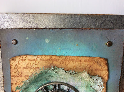
This is the front cover; layered up with inked and stamped papers and canvas.
Then with plaster and dyed calico or perhaps muslin.
On top of those layers went a distressed clock part and a decorative metal circle embellishments (both Finnabair I think) and standard, every day, common ol'garden washer which France had pre-rusted for us. Can you see the tiny signature heart? France taught us how to make these during the workshop but it's a closed secret. You have to take one of her workshops to find out how they’re made…adorable aren’t they?
For me the colour of rusted metal and tiny blood red hearts are synonymous of France, who I’ve watch work her magic with her JOM posts for ever. Every time I walk past my "revised" art journal it reminds me of her… it just feels soooooooo France.
Here are a few more pictures…….
I decided I wanted to add one of the Ranger Word Bands to the front cover but in retrospect I wish I'd done this with a couple of rusted brads now. C'est la Vie.
To pick up the blood red colour of the little heart I added seam binding coloured with Distress Ink.
I absolutely love the texture of all those layers on the front cover now, especially the coloured muslin and the subtle simmer and stamping on both the back and front base covers.
Inside the journal is just plain watercolour paper.... pristine and ready for creativity!!!!
Hope you like my journal and France isn’t peeved by the amalgamation of her workshop projects… oh, and if you’re wondering what happened to all the little potions and spells bottles from the Witches & Apothecaries wall hanging, well they're snug and happy on my printer’s tray configuration shelf.
Happy crafting and thank you for taking a peek at my post.
Carol. x


Oh wow! What an awesome design and binding!!!
ReplyDeleteHi, all down to the amazing France. Just have to fill the journal with all sorts of craftiness...lol. Hugs. C xx
ReplyDelete